GROWLr Spills the Tea on their New Logo
GROWLr unveiled a brand-new logo last week and we’ve got all the details.
GROWLr has been continually finding new ways to reinvent itself in service to the bear community. The GROWLr Live feature, introduced during the pandemic, has revolutionized the way we communicate and flirt over the apps. As the live feature has evolved its been used as a platform for panels, to disseminate vital health information and even to host a comedy club. In order to keep up with the app’s ever-changing dynamics, the folks over at GROWLr knew it was time for a visual refresh that would match the changes occurring within the app.
“We knew for a while that GROWLr was in need of a visual update” said Phil Hendricks, the Senior Marketing Director over at GROWLr, “but it’s such an iconic brand that we wanted to be sure we got it right. While we wanted to update the logo, it was important for us to remain true to the brand and to be sure any new logo incorporated GROWLr’s commitment to the bear community.”
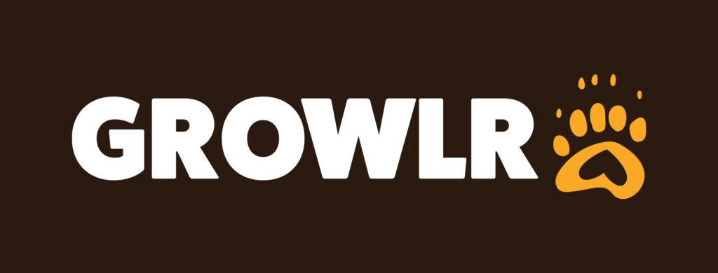
As you can see from the image above, the new logo has changed from a bear face emoji on a yellow background to a yellow bear paw with a heart in the center on a brown background. The logo was given a soft launch late last week with the intent to update across all interfaces soon.
“Our designers worked for quite a while and came up with roughly eight design concepts for us to consider” continued Hendricks. “We narrowed it down to three final designs and then to be completely honest – we let the members decide. We have such loyal members, and we know how connected they are to the brand, so it was the only way to move forward with the process. Luckily our members are not afraid to voice their opinions and we got tons of feedback, in the end the bear paw with heart was the clear winner.”
What do you think of GROWLr’s new logo?

Follow GROWLr on Facebook and Instagram.


O GROWLr está sendo uma das belas surpresas após eu retornar a usar as redes sociais. Parabéns.